Wyoming FRNT’s official visual system exposes a trifecta of lowbrow design, meme-like token aesthetics, and patchwork assembly.
U.S. MSB Daily News
USMSB.com – Wyoming has made fintech history. On January 7, 2026, the state announced that $FRNT (Frontier Stable Token)—issued by the Wyoming Stable Token Commission—is live and available to the public, positioning it as the first state-issued, fiat-backed stable token in the United States.
But while FRNT’s institutional scaffolding is designed to project rigor—fully reserved, dollar-linked, and marketed as a public-entity alternative to private stablecoins—the project’s visual identity undermines the very legitimacy the state is trying to signal.
In modern markets, design is not decoration; it is governance communication. Logos and token icons function as shorthand for credibility—especially in crypto, where the public is trained to treat weak presentation as a proxy for weak controls. By that standard, Wyoming’s visual system reads less like a state-backed instrument and more like an underdeveloped brand package rushed to meet a launch window.
The Institutional Facts Say “Conservative.” The Visuals Say “Casual.”
FRNT is promoted as a fully reserved, fiat-backed token issued by a U.S. public entity under the oversight of the Wyoming Stable Token Commission. Industry coverage and partner materials further describe a legally mandated 102% reserve ratio and reserves invested in cash and short-duration Treasuries—exactly the kind of conservative framework meant to manufacture trust.
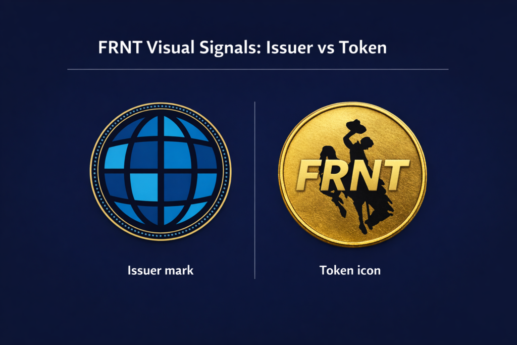
Yet the project’s “face”—the commission’s emblem and the FRNT token icon—fails to translate those assurances into visual authority. The result is a communications contradiction: institutional policy wrapped in retail-grade aesthetics.
Commission Logo: Generic Form, Minimal State Signal
Stripped of explanatory text and seals, the commission’s logo functions as a generic globe mark—a visual category so common that it struggles to imply jurisdiction, legal mandate, or public accountability.
That matters because most real-world exposure happens at small sizes and in low-context environments: website headers, social avatars, thumbnails, and embedded graphics. On the commission’s own site, the emphasis is on the token and distribution, while the issuer’s visual identity does little to carry the weight of “state-backed.”
Why it fails as an institutional mark:
- Authority deficit: it does not read as a state entity at a glance.
- Low recognizability under compression: when reduced or isolated, it becomes effectively interchangeable with commodity iconography.
A government issuer does not have the luxury of “neutral branding.” Neutral is not neutral—it is ambiguous. And in markets, ambiguity is often interpreted as risk.
FRNT Token Icon: High Recognition, Low Gravitas
The FRNT token icon’s core problem is not that it is simple; it is that it is simple in the wrong way. A gold coin motif and large ticker-style letters may achieve quick scan recognition on exchanges, but they do not communicate what FRNT is trying to be: a state instrument engineered for credibility.
The icon, as described and circulated across market venues, leans into an aesthetic widely associated with speculative tokens: bold initials, coin-like gradients, and “badge” styling that connotes promotion more than policy. In a category plagued by fraud and unserious projects, the design choice inadvertently invites the very comparison a public issuer must avoid: meme-coin semiotics.
The cost is not merely reputational. For a stablecoin—where adoption depends on perceived safety—the icon becomes a behavioral nudge. If the first impression is “retail gimmick,” users infer (fairly or not) that the governance layer may be equally lightweight.
A Clean Control: FedMSB’s Concept Graphics Show What Coherence Looks Like
Contrast this with the Federal Money Services Business Association (FedMSB) concept visuals for a U.S. payment stablecoin, which explicitly encode meaning: a stylized “1” for the peg, blockchain ring elements, and binary motifs intended to communicate technical formality and monetary discipline.
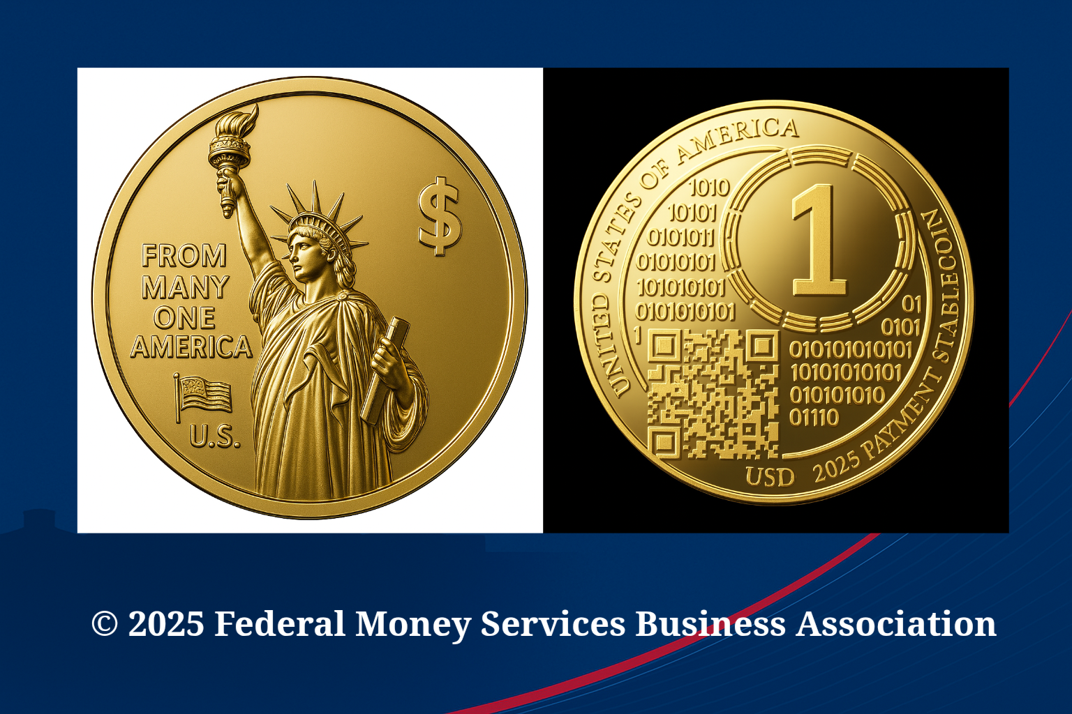
Even if one views the FedMSB materials as aspirational branding rather than sovereign design, the difference is instructive:
- FedMSB concept: symbolism is integrated with the product claim (parity, infrastructure, machine-readable trust cues).
- FRNT’s current visuals: recognition exists, but meaning is thin—especially meaning that reinforces “public accountability” and “institutional-grade reserves.”
This is the central critique: FRNT’s visuals do not operationalize its own narrative.
The Strategic Risk: When Design Undercuts Governance Messaging
Wyoming’s own launch framing emphasizes public oversight and trust—particularly in contrast to privately issued stablecoins. That argument is strongest when the public can see the difference immediately. Instead, FRNT forces observers to do extra cognitive work: the institutional credibility is buried in documentation and press releases, while the surface-level signals are visually indistinct from tokens with no oversight at all.
In communications terms, that is an avoidable self-own.
Where the mismatch bites hardest:
- Public trust: casual audiences equate “official” with seals, heraldry, or unmistakable government cues—not generic tech marks.
- Distribution environments: on exchanges and wallets, the token icon becomes the brand; the issuer disappears.
- Narrative vulnerability: critics don’t need to attack the collateral structure—mockery of the aesthetic does the reputational damage for them.
In a market conditioned by repeated stablecoin controversies, projects cannot afford to look unserious—especially when the issuer is the state.
Bottom Line
FRNT may be structurally conservative, but its visual system is not. The commission logo fails to project governmental authority, and the token icon overcorrects toward retail recognizability at the expense of institutional gravitas. Meanwhile, concept visuals like FedMSB’s demonstrate that it is possible—without abandoning crypto-native design—to embed clear “trust architecture” into visual language.
Wyoming’s stable token effort is, on paper, a landmark. But in public markets, perception is part of the product. And right now, FRNT’s visual narrative tells the wrong story.
Related Articles:
- Wyoming’s ‘State Stable Token’ Is a Public-Trust Hijack — A Money Loop Wearing 588,000 People’s Reputation
- From Issuer Logo to Token Icon: Wyoming’s FRNT Visual Narrative Falls Flat.
- Wyoming’s FRNT: One-Exchange Trading, Rising Costs, and an $8.1 Million Budget Request
- Wyoming’s “FRNT” Stable Token: Four Letters, Three Worlds, One Big Headache
U.S. MSB Daily News
Industry News • Regulatory Analysis • Learning Center
Leave a Reply